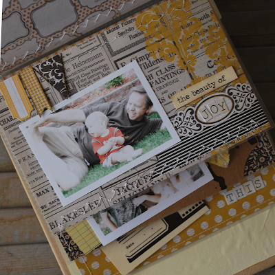
Sharing with you the "True Beauty" mini book from the November kit. Loved it. Loved it good.
Mostly I loved how the colors melded together so beautifully. The sweet yellow and blacks and greys worked together so wonderfully that this album could not have been anything less than a book of 'true beauty'.
For me the album took shape with photos that drew me in. Photos that told me a story of beauty. Photos that for me were going to be timeless. Each page celebrated the beauty of the dream of a little one, or the joy of father and son, or the beauty of adoration between two brothers. It took on a life of it's own as I played with the paper, tags and seam binding.
A couple of things are a bit untraditonal about the creating of this mini album. Instead of the book opening from right to left, I decided to have it open from the bottom to the top. You'll see what I mean in a minute. Another thing that is different is how each page is layered on top of the other with several peeking out from underneath. I love this technique. I trimmed the page protectors, and sewed the foundation papers to the page protector. I just love to be able to feel the texture of the papers and the different surfaces.
Let's take a closer look. Warning...this is photo heavy::
The kraft album cover makes for a fabulous canvas. I just started playing with the tags, stamps and flowers. The cork circle...can we say adorable? Punched and trimmed some of the pattern paper and layered away. Sometimes this process can be so freeing.
Here's a close up...just because I love close ups.
This is the opening page. I trimmed the first page protector to about 3 inches. The foundation page was then sewed to the top of the page protector. Then again with the layering. The wallet size photo hangs over the front a bit just to add to the texture of the page. And you can see two other pages peeking out from underneath the beginning page.
This page protector was trimmed to about 4 1/2 inches. (Note: I took the pages out of the album so that I could sew them better with my machine. After I was all done, I re-assembled the book.) The process was the same:: sew foundation page to the page protector, and then layer away. See how I used the charcoal tag with the heart punch. I liked how that worked out. Sometimes (make that alot of times) you just get lucky.
This is the third page, and it ended this set of pages. We start all over again with the next page layout.
And this next page HAS to be my favorite of the book. Who can resist that sweet face? O.K...I digress...back to the book. If you follow me on here even a little, then you know how I don't re-create an original layout every time. Especially when it comes to a mini album. I usually repeat elements and pages. I mostly did the same here with this page. Notice how similar it is to the very first page of the mini.
This album has a total of ten pages, so the last set of layouts is in a group of four. I just adjusted the size of the page protectors so that I could still have them all layered.
This has been one of my most favorite projects to do for the gallery. It gave me great joy in the process of creating and designing each page. And that for me is the true beauty of this paper arts world we live in.
ETA: We have TWO of these amazing kits left if you would like to make one of your own!


No comments:
Post a Comment